I bought this cartridge a month or so ago and have been playing with it a bit since then.
There are some wonderful ideas on the cartridge, both for pop-up cards and flat cards as well as some great words and images that you can use on different types of projects.
The first cards I made with the cartridge were all done using the pop-up features. Each of the images has a number of different layers associated with it, some have more than others. There is usually an image with a layer and shadow, as well as a phrase, phrase layer and pop-up. Some images have 2 different pop-up layers and you can choose which you want to use. Each image also has a card which you can cut to the size you want. All the cards have different edges to them.
This card has a cute little plane that pops up when you open it.

I also added some texture to the background by embossing the base layer and using a die cut scalloped oval which I added some shading to with distress ink.
For the inside of the card, I used the pop-up phrase, which is multi-layered. To make the letters stand out, I added some faux stitching to some of them
This note card was fun to do. I cut the bird and added some texture to his wing by embossing it with my favourite swiss dots folder. The card has a wavy edge so I cut it three times in different card to get a layered effect on the edge.
After I tried using the the pop-up features, I decided to play with some of the images and do some creative things using the Cricut Craft Room.
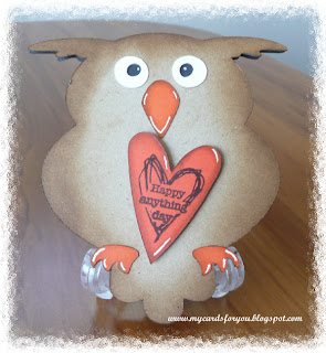
For this card, I took the owl image and made it into a shaped card. Then I cut the top layer using the same image and added the various layers.
I inked the edges of the shapes with distress ink and added a little die cut heart with a stamp on it.
For my last card, I used the butterfly image and cut it at 2.5" using matching card for the upper and lower layers of the butterfly. I then placed the card layer on the mat and added the shadow butterfly in the centre of the card.
I added toning card to the back of the hole cut in the card then layered the butterfly on top of that after folding the wings upward slightly to give some dimension. The bling was added to the body of the butterfly.
I found this cartridge to have some great ideas for projects, not just cards, but images for layouts as well. You are only limited by your own imagination!
I did find it a little frustrating that there are not clear instructions included with the cartridge for putting the pop-up pieces together. There is a PDF available at the Cricut Support website with some indications of how the pop-ups work, but it would be great if there was more detail with it. You can do a class on-line but that has a cost.


2 comments:
Hi Janet , I found you through Charlotte... Your cards are beautiful and thankyou for introducing me to this cartridge, it is on my must have list!!! I am a new follower!
Hi Janet!!
This is just an amazing showcase. Thank you for sharing your beautiful projects with us!
Charlotte
Post a Comment