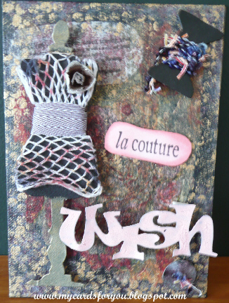
Last year, I gave Carol and Jude (friends from Card Making World forum) some die cuts and stamped images to challange them to create something a little different. This is what I came up with using the same stamps, die cuts and ribbon.
The die cuts were made using a Tim Holtz Alterations Die. I painted the die cuts black then added some gold to the dress form. Wound fancy wool around the thread card and tied a knot in the button with the same thread. I used some fancy knitting netting to make the dress and dabbed alcohol ink onto it to give it some colour. Added a flower to the top. Wound the ribbon around the waistline to make a belt.
The stamped images were from a Toodle Binks set which was a freebie from Craft Stamper last year when I renewed my subscription.
The canvas black was painted black then coloured using alcohol inks and gold paint dabber. Applied a floral paper serviette with Mod Podge to give more colour on the background. The wish word was also die cut and painted with Worn Lipstick Crackle Paint.
Over the last few years, my interests have changed a little. I have developed an interest in patchwork and quilt making which seems to have overtaken my interest in card making! I still make cards, but not as much as I used to. Hence the change name for this blog.
Showing posts with label alcohol inks. Show all posts
Friday, February 3, 2012
Wednesday, November 16, 2011
Craft Barn Calendar Challenge Week 10
The theme for this week's calendar challenge at the Craft Barn is Autumn colours and leaves with the added option to use Tim Holtz tools and products.
The tag is embossed with the woodgrain folder from Tim Holtz Texture Fades range and coloured with frayed burlap and brished corduroy distress inks. The leaves were cut using Marianne Creatables dies as the tattered leaves dies were a little big for this particular project. For the leaves, I first coloured glossy cardstock with Ranger Alcohol Inks in autumnal colours then cut them with the dies. These dies have a great texture built in and the close up photo below shows the detail on the leaves.

I also cut some little acorns from brown card using the same set of dies then covered them with Glossy Accents. I attached these with foam pads to make them stand out from the tag.
I blended wild honey and rusty hinge distress inks on the edges of the calendar to give it a more auntumnal look as well.
The ribbon is seam binding coloured with Spiced Marmalade distress ink.
Can't wait for the last two weeks challenges because I am eager to see the whole calendar put together on the canvas I plan to buy tomorrow!!
I have just seen on the stats for my blog that this is my 150th post!
The tag is embossed with the woodgrain folder from Tim Holtz Texture Fades range and coloured with frayed burlap and brished corduroy distress inks. The leaves were cut using Marianne Creatables dies as the tattered leaves dies were a little big for this particular project. For the leaves, I first coloured glossy cardstock with Ranger Alcohol Inks in autumnal colours then cut them with the dies. These dies have a great texture built in and the close up photo below shows the detail on the leaves.

I also cut some little acorns from brown card using the same set of dies then covered them with Glossy Accents. I attached these with foam pads to make them stand out from the tag.
I blended wild honey and rusty hinge distress inks on the edges of the calendar to give it a more auntumnal look as well.
The ribbon is seam binding coloured with Spiced Marmalade distress ink.
Can't wait for the last two weeks challenges because I am eager to see the whole calendar put together on the canvas I plan to buy tomorrow!!
I have just seen on the stats for my blog that this is my 150th post!
Saturday, August 27, 2011
Father's Day
It is Father's day here in New Zealand next weekend and I thought I would make a few cards.
For this card I used some patterned card that I made using alcohol inks and wiping the colours onto glossy card using a folded tissue. I wiped the tissue up and down as well as side-to-side to produce a plaid effect.
I stamped the ties onto white card and onto the glossy card that I had coloured, cut out the tie from the coloured card and attached them to the white card.
The stamps used for this card both came from Montarga.
For this card, I used a number of stamps to make the scene. The golfing stamps are from a set I purchased recently. The grass and the trees are Montarga stamps and the hills in the background are a stamp designed by Sue Law which I use for a lot of backgrounds.
To make the card, I stamped the golfball on the tee, then masked it and stamped the golfer. The background was stamped successively starting with the grass, the hills and the trees. Each was masked before stamping the next layer. Finally, I added the sentiment.
I coloured the golfer with Copic markers, then layered the card onto a red base card.
I have entered this card in the Craft Room Challenge this week as the theme is Masking! Thanks Zoe!!
I used the same technique of stamping and masking for this card as well.
The fisherman and the fish stamps are from the same set as the golfer.
The background stamp is the same as used in the above card.
For this card I used some patterned card that I made using alcohol inks and wiping the colours onto glossy card using a folded tissue. I wiped the tissue up and down as well as side-to-side to produce a plaid effect.
I stamped the ties onto white card and onto the glossy card that I had coloured, cut out the tie from the coloured card and attached them to the white card.
The stamps used for this card both came from Montarga.
For this card, I used a number of stamps to make the scene. The golfing stamps are from a set I purchased recently. The grass and the trees are Montarga stamps and the hills in the background are a stamp designed by Sue Law which I use for a lot of backgrounds.
To make the card, I stamped the golfball on the tee, then masked it and stamped the golfer. The background was stamped successively starting with the grass, the hills and the trees. Each was masked before stamping the next layer. Finally, I added the sentiment.
I coloured the golfer with Copic markers, then layered the card onto a red base card.
I have entered this card in the Craft Room Challenge this week as the theme is Masking! Thanks Zoe!!
I used the same technique of stamping and masking for this card as well.
The fisherman and the fish stamps are from the same set as the golfer.
The background stamp is the same as used in the above card.
Sunday, May 22, 2011
Craft Room DT Call
My friend Zoe is working with the owner of the Craft Room, Julia, to coordinate a design team for the new challenge blog. Well, I thought to myself, why don't you give it a go as you need a bit more of a challenge at the moment! So here goes...
When we were cleaning up my mother's house, I found this box that she had kept pens in. She had it for many years and it was originally a box for tea! I decided to decorate it for her to keep then pens she needs in her new home.
I gave it a distressed look by painting it with a wine coloured paint then going over it with a cream colour using the PVA technique - painting a layer of slightly thinned PVA then covering it with the paint.
I coloured the additional bits of the swirls with my copic markers .
The inside of the box was covered with a dark green card and the edges painted with gold paint.
To finish it off, I added the flocked chipboard letters P E N S which I had coloured using a gold dabber paint. This enabled to flock feature to remain a little textured.
Starngely enough, when I gave it to my mother, she asked if that was the box she had kept her pens in at home!! Alteration does not necessarily change!!!
The second project is a book I made for a friend. I haven't put the photos in it yet as I want it to be a surprise.
The pages were all cut using the Tim Holtz Alterations Mini Cabinet Card Die. I used heavy card for the base for each page and covered them with different papers from my stash. Each page was edged with vintage photo distress ink to give it an aged look.
The cover has a large flower die cut from the Tattered Florals die (Tim Holtz Alterations Dies). I cut the flowers from 2 different papers and alternated the layers. Each layer has been sprayed with Cosmic Shimmer (silvery colour) then edged with Vintage Photo. I shaped the petals on each layer to provide a bit of depth to the flower. The centre is a large diamante. I also cut two leaves and gave them the same treatment as the flower's layers.
Each page in this book is different.
The page inside the front cover has a journalling stamp so that I can write a message to my friend.
Some of the following pages have frames on them. The frames for the photos (which I will add later!) were cut using nestabilies dies from Spellbinders. I also embossed the frames to define the edges more.
Paper flowers and a crochet flower have been added to some of the frames. The flower on this page was coloured by stamping Versamark ink onto the petals then dusting with Perfect Pearl powder (green). A yellow brad was added to the centre of the flower.
Background stamps have been used to provide a little detail to the pages. One page was stamped with glimmer mist which I first sprayed on a foam pad then stamped the background stamp on it to pick up the ink. Another page was stamped using white paint from a dabber which I applied directly to the stamp.
I also used a mesh stamp to provide some interest on this page.
Some of the pages use different techniques. For instance, the next page is made like an envelope. I folded the card before I cut it and placed the fold just inside the cutting edge of the die. I then cut the top of one side with a tab die (TH again!). I added a couple of cards to the envelope with some nice sentiments from Tim Holtz. (I got some new stamps recently and wanted to use them - this project seemed like a great opportunity!)
I added a little die cut with a nice sentiment to finish this page off.

This page is made from a heavy card that I embossed with the patchwork quilt folder and inked up with shabby shutters, faded jeans, chipped sapphire and vintage photo. Added a little bird from Kaisercraft and a key cut with the cricut expression and rusted up with vintage photo distress ink and clear rock candy distress crackle paint.

This page is made from acetate which I coloured using alcohol inks in blue, yellow and green shades. Also added some metallic copper to give it a little depth. The acetate is attached to the base card with little dots of Glossy Accents. Amazing stuff as it does not show through the acetate.
This page has a lovely sentiment from Hero Arts - The future belongs to those who believe in their dreams.
I cut the tag with a nestabilities tag die and cut the backing by tracing around the outer edge of the die. This works really well to provide a shadow for these tag dies.
The flower centre is done by adding gold metallic beads with glossy accents.
The final page in the book explains the journey of the book. The sentiment stamp is from a Darkroom Door set and the poppies are from Montarga, stamped with rusty hinge and overlaid with a cute balls and sticks stamp (bundled sage) that I got from the lovely Wendy at The Stamp Attic in Wantage last year.
This is one of a series of ATCs that I made some time ago. It is a tri-shutter ATC, measuring 3.5 by 2.5 inches when it is folded flat.
I used tattered rose and weather wood distress inks to colour the card and used the same inks to stamp the delightful little cogs (designed by Zoe!). The Eiffel Tower stamp was one I picked up at the Craft Barn last year - I think it is by Crafty Individuals. The ticket was cut around the ticket stamp - Tim again!!
I would love to contribute to the Craft Room's Challenge Design Team. I love using a range of different techniques and enjoy teaching other people about using them. I also think that it would provide me with some more challenges that I am really ready for. Enjoy!
When we were cleaning up my mother's house, I found this box that she had kept pens in. She had it for many years and it was originally a box for tea! I decided to decorate it for her to keep then pens she needs in her new home.
I gave it a distressed look by painting it with a wine coloured paint then going over it with a cream colour using the PVA technique - painting a layer of slightly thinned PVA then covering it with the paint.
I coloured the additional bits of the swirls with my copic markers .
The inside of the box was covered with a dark green card and the edges painted with gold paint.
To finish it off, I added the flocked chipboard letters P E N S which I had coloured using a gold dabber paint. This enabled to flock feature to remain a little textured.
Starngely enough, when I gave it to my mother, she asked if that was the box she had kept her pens in at home!! Alteration does not necessarily change!!!
The second project is a book I made for a friend. I haven't put the photos in it yet as I want it to be a surprise.
The pages were all cut using the Tim Holtz Alterations Mini Cabinet Card Die. I used heavy card for the base for each page and covered them with different papers from my stash. Each page was edged with vintage photo distress ink to give it an aged look.
The cover has a large flower die cut from the Tattered Florals die (Tim Holtz Alterations Dies). I cut the flowers from 2 different papers and alternated the layers. Each layer has been sprayed with Cosmic Shimmer (silvery colour) then edged with Vintage Photo. I shaped the petals on each layer to provide a bit of depth to the flower. The centre is a large diamante. I also cut two leaves and gave them the same treatment as the flower's layers.
Each page in this book is different.The page inside the front cover has a journalling stamp so that I can write a message to my friend.
Some of the following pages have frames on them. The frames for the photos (which I will add later!) were cut using nestabilies dies from Spellbinders. I also embossed the frames to define the edges more.
Paper flowers and a crochet flower have been added to some of the frames. The flower on this page was coloured by stamping Versamark ink onto the petals then dusting with Perfect Pearl powder (green). A yellow brad was added to the centre of the flower.
Background stamps have been used to provide a little detail to the pages. One page was stamped with glimmer mist which I first sprayed on a foam pad then stamped the background stamp on it to pick up the ink. Another page was stamped using white paint from a dabber which I applied directly to the stamp. I also used a mesh stamp to provide some interest on this page.
Some of the pages use different techniques. For instance, the next page is made like an envelope. I folded the card before I cut it and placed the fold just inside the cutting edge of the die. I then cut the top of one side with a tab die (TH again!). I added a couple of cards to the envelope with some nice sentiments from Tim Holtz. (I got some new stamps recently and wanted to use them - this project seemed like a great opportunity!)I added a little die cut with a nice sentiment to finish this page off.

This page is made from a heavy card that I embossed with the patchwork quilt folder and inked up with shabby shutters, faded jeans, chipped sapphire and vintage photo. Added a little bird from Kaisercraft and a key cut with the cricut expression and rusted up with vintage photo distress ink and clear rock candy distress crackle paint.

This page is made from acetate which I coloured using alcohol inks in blue, yellow and green shades. Also added some metallic copper to give it a little depth. The acetate is attached to the base card with little dots of Glossy Accents. Amazing stuff as it does not show through the acetate.
This page has a lovely sentiment from Hero Arts - The future belongs to those who believe in their dreams.
I cut the tag with a nestabilities tag die and cut the backing by tracing around the outer edge of the die. This works really well to provide a shadow for these tag dies.
The flower centre is done by adding gold metallic beads with glossy accents.The final page in the book explains the journey of the book. The sentiment stamp is from a Darkroom Door set and the poppies are from Montarga, stamped with rusty hinge and overlaid with a cute balls and sticks stamp (bundled sage) that I got from the lovely Wendy at The Stamp Attic in Wantage last year.
This is one of a series of ATCs that I made some time ago. It is a tri-shutter ATC, measuring 3.5 by 2.5 inches when it is folded flat.
I used tattered rose and weather wood distress inks to colour the card and used the same inks to stamp the delightful little cogs (designed by Zoe!). The Eiffel Tower stamp was one I picked up at the Craft Barn last year - I think it is by Crafty Individuals. The ticket was cut around the ticket stamp - Tim again!!
I would love to contribute to the Craft Room's Challenge Design Team. I love using a range of different techniques and enjoy teaching other people about using them. I also think that it would provide me with some more challenges that I am really ready for. Enjoy!
Sunday, December 19, 2010
More Tags
I have now finished a further four tags in Tim's 12 Tags of Christmas for 2010.
Again, I didn't have all the images that Tim used but used some of the stamps I already had and improvised! The pine needles is a Tanda stamp that I picked up in May. The pine cone was cut with the Cricut from the Joys of the Season cart.
Instead of using a stamp for the branch, I cut one using the Songbird card in the Cricut. The bird was also cut with the Cricut and stamped with a music stamp, then coloured using Fired Brick DI. The rosette was made following Tim's instructions, with tissue tape and topped with a button. The image is one I found in a Christmas set. I cut it out, then edged with Walnut Stain DI and stamped with joy stamp using walnut stain DI. The white specks on the tag were made using the snow cap dabber before I inked the edges of the tag. The DI wipes off the paint and leaves it standing out slightly.
For this tag, I cut the trees, deer and wreath using the cricut. The trees were inked with distress inks. The deer was embossed with the snowflakes folder in the CB, then painted with blue paint and sanded on the raised embossing to provide the multicoloured effect. The tag was coloured using blue distress inks and edged with vintage photo. The sentiment was stamped with fired brick and edged with vintage photo. Tissue tape was added to the bottom.
For this one, I cut some background paper and attached it to the tag. Added a santa picture that I cut from other paper. Edged the tag with stormy sky DI. The large clear embellishment was coloured with alcohol ink then the snowflake stamped with archival ink then wiped off before it dried. Stuck the embellishment to white card and cut it out. Added the bling to the bottom of the tag. The sentiment is stamped in fired brick DI.
Have really enjoyed doing these tags and hopefully, might get the rest finished before Christmas - only 5 days to go!
Again, I didn't have all the images that Tim used but used some of the stamps I already had and improvised! The pine needles is a Tanda stamp that I picked up in May. The pine cone was cut with the Cricut from the Joys of the Season cart.
Instead of using a stamp for the branch, I cut one using the Songbird card in the Cricut. The bird was also cut with the Cricut and stamped with a music stamp, then coloured using Fired Brick DI. The rosette was made following Tim's instructions, with tissue tape and topped with a button. The image is one I found in a Christmas set. I cut it out, then edged with Walnut Stain DI and stamped with joy stamp using walnut stain DI. The white specks on the tag were made using the snow cap dabber before I inked the edges of the tag. The DI wipes off the paint and leaves it standing out slightly.
For this tag, I cut the trees, deer and wreath using the cricut. The trees were inked with distress inks. The deer was embossed with the snowflakes folder in the CB, then painted with blue paint and sanded on the raised embossing to provide the multicoloured effect. The tag was coloured using blue distress inks and edged with vintage photo. The sentiment was stamped with fired brick and edged with vintage photo. Tissue tape was added to the bottom.
For this one, I cut some background paper and attached it to the tag. Added a santa picture that I cut from other paper. Edged the tag with stormy sky DI. The large clear embellishment was coloured with alcohol ink then the snowflake stamped with archival ink then wiped off before it dried. Stuck the embellishment to white card and cut it out. Added the bling to the bottom of the tag. The sentiment is stamped in fired brick DI.
Have really enjoyed doing these tags and hopefully, might get the rest finished before Christmas - only 5 days to go!
Sunday, July 18, 2010
SENZ
Well, it was SENZ weekend here in Christchurch and it was the place to be for stampers and scrapbookers!
Lots of displays by retailers from all over NZ and lots of classes and demos for people to attend. Some of the Crafty Girls met up yesterday for a guided trip around the retailers and went home very happy with lots of goodies and a lot less cash!
I bought a few things, as you can see from the picture at the left - some darkroom door stamps, clear stamps from Kaisercraft, some plastic face moulds, distress embossing powder, a leaf punch and some other stuff!
Today, I went back again to do a vintage clock class. Mel and Ali from Kaisercraft in Australia were running the class and they were just lovely.
This is the clock I finished at home - it always takes longer to do something like this for the first time. The clock is a pre-designed set available from Kaisercraft and is made from MDF. Covered the square base with Kaisercraft paper and distressed around the edges with Walnut Stain. Others painted around the edges, but you know me and my penchant for distressing!! Added pearls to the edges which had been coloured with alcohol ink to make them look a bit more vintage. The keys and the numerals were cut with a cricut then coloured with walnut stain DI and painted with Distress Crackle paint. The frame was covered with another KC paper and the edges again distressed. I cut the flowers from another sheet of KC paper, rolled the edges and distressed, then shaped them a bit so they would stand out from the base. Glitzed with gold GM and attached using glue for the bigger flowers and foam mount for the smaller ones. The photo mount has some beautiful cotton ecru coloured lace along one side and the keys are attached with ribbon. The pictures in the photo mount are from a Victorian Birthdays CD that I sort of adapted to provide the sepia look. Of course, it looks so much better in real life than in the photo and I am quite pleased with the end result. Thanks Mel and Ali!
The other great thing that happened was that I won a prize in a draw in the class and came home with some lovely goodies from Kaisercraft - Thanks Kaisercraft - I shall really enjoy using them all.
Lots of displays by retailers from all over NZ and lots of classes and demos for people to attend. Some of the Crafty Girls met up yesterday for a guided trip around the retailers and went home very happy with lots of goodies and a lot less cash!
I bought a few things, as you can see from the picture at the left - some darkroom door stamps, clear stamps from Kaisercraft, some plastic face moulds, distress embossing powder, a leaf punch and some other stuff!
Today, I went back again to do a vintage clock class. Mel and Ali from Kaisercraft in Australia were running the class and they were just lovely.
This is the clock I finished at home - it always takes longer to do something like this for the first time. The clock is a pre-designed set available from Kaisercraft and is made from MDF. Covered the square base with Kaisercraft paper and distressed around the edges with Walnut Stain. Others painted around the edges, but you know me and my penchant for distressing!! Added pearls to the edges which had been coloured with alcohol ink to make them look a bit more vintage. The keys and the numerals were cut with a cricut then coloured with walnut stain DI and painted with Distress Crackle paint. The frame was covered with another KC paper and the edges again distressed. I cut the flowers from another sheet of KC paper, rolled the edges and distressed, then shaped them a bit so they would stand out from the base. Glitzed with gold GM and attached using glue for the bigger flowers and foam mount for the smaller ones. The photo mount has some beautiful cotton ecru coloured lace along one side and the keys are attached with ribbon. The pictures in the photo mount are from a Victorian Birthdays CD that I sort of adapted to provide the sepia look. Of course, it looks so much better in real life than in the photo and I am quite pleased with the end result. Thanks Mel and Ali!
The other great thing that happened was that I won a prize in a draw in the class and came home with some lovely goodies from Kaisercraft - Thanks Kaisercraft - I shall really enjoy using them all.
Friday, July 9, 2010
Hats
Made some ATCs for a swap and for the LTD challenge this week, but I may have missed it again!!
The theme was Hats or Crowns.
I used alcohol inks to colour the backgrounds, added some lace, stamped some hats and handbags, then added peeloffs that I had attached to other papers then cut out. To finish, added some bling on 2 corners and peel of corners on the others.
The theme was Hats or Crowns.
I used alcohol inks to colour the backgrounds, added some lace, stamped some hats and handbags, then added peeloffs that I had attached to other papers then cut out. To finish, added some bling on 2 corners and peel of corners on the others.
Subscribe to:
Posts (Atom)


